ESACM
a website for Clermont-Ferrand School of Fine Arts
An editorial website
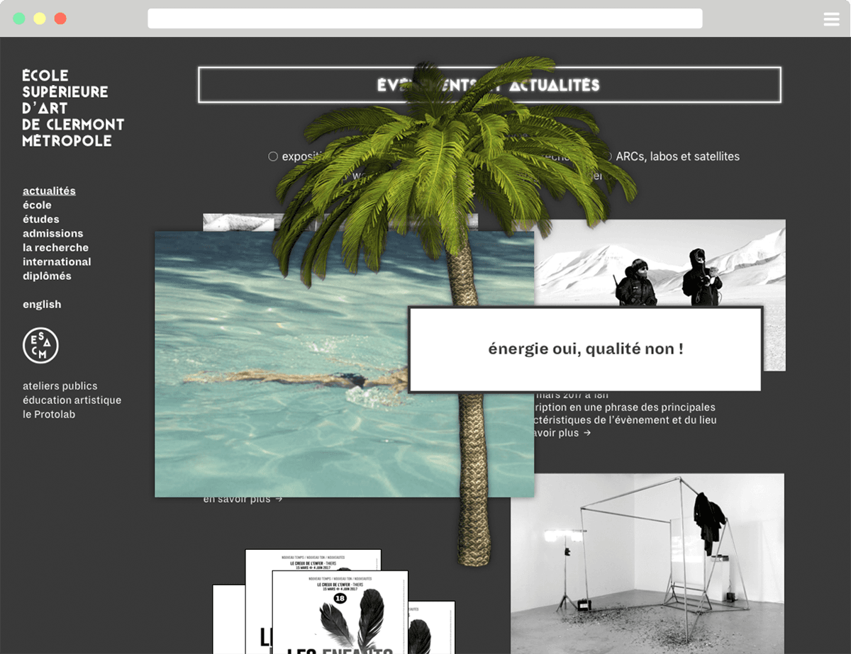
Art school websites are often designed as purely informative places, and not enough as editorial tools. To communicate the life of the school and the richness of its proposals, we conceived this site as a presentation and archiving space, but also as a communication and expression one. A changing and living space. Upon arrival on the site, the home page, thought as a display area, reflects the activity and dynamism of the school.
A hybrid design
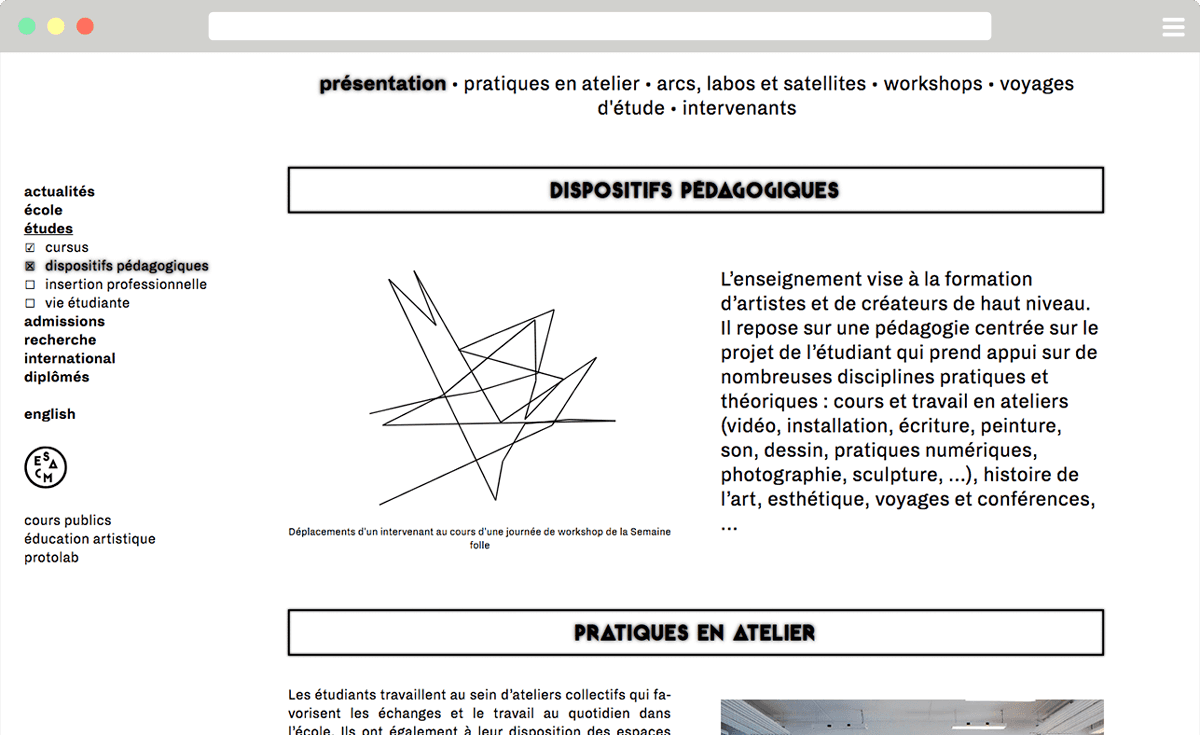
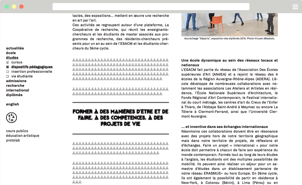
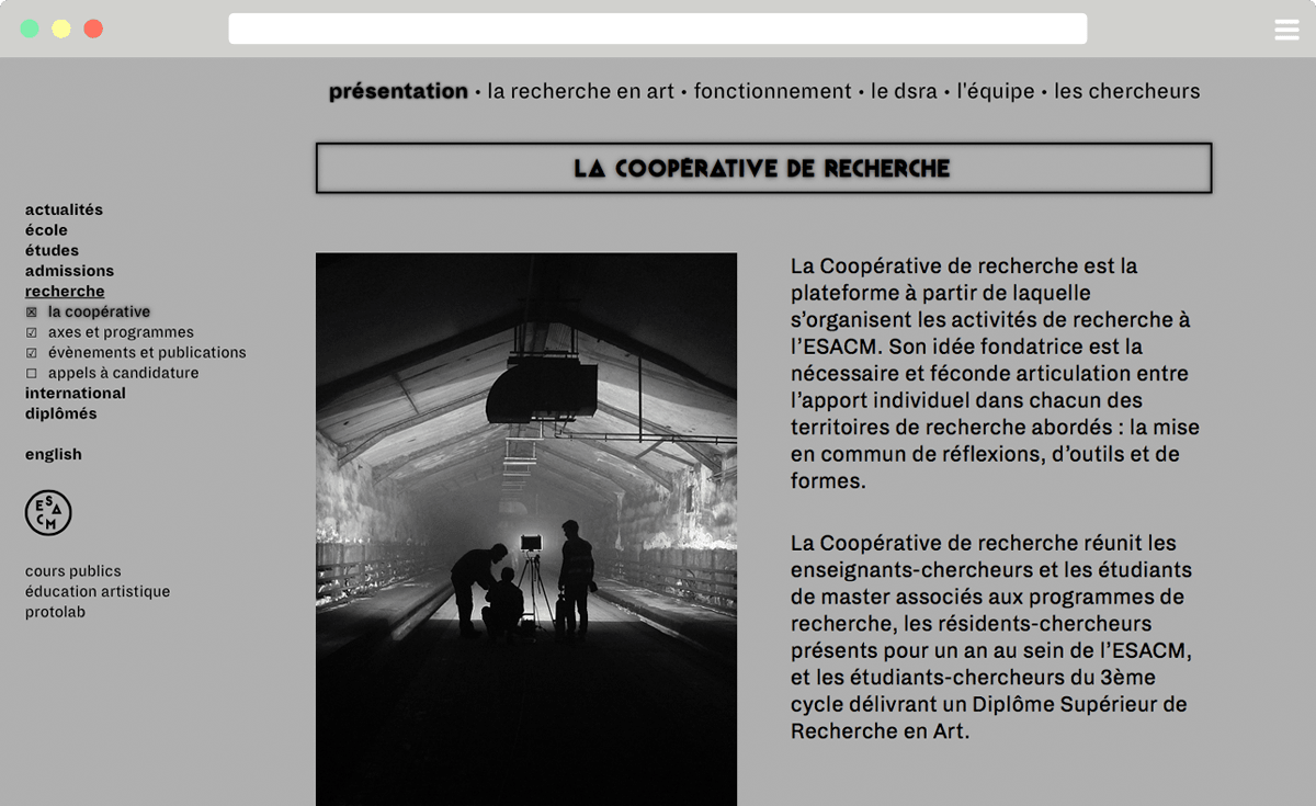
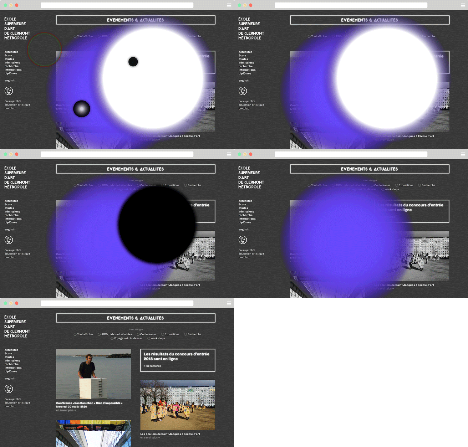
Over the pages, some elements disturb the seriousness and the apparent simplicity of the identity and reveal a more unusual and fictional aspect. Indeed, the halos on titrations and the intrusion of glyphs in the text bring back a digital strangeness that questions the visitor.
An expression place
We wanted to offer within the ESACM website an open space, dedicated to teachers, artists in residency and students. Rather than a dedicated page, we designed an interference zone, with pop-ups that appear when loading the home page and superimpose the content of the site. These pop-ups can take the form of text blocks, images or animated GIFs. They are placed on the home page randomly, and change of configuration with each new loading.This space is meant to be appropriable and changing, and can be invested in various ways, depending on the projects of each.
visiter le site esacm.fr