Graphisme en France
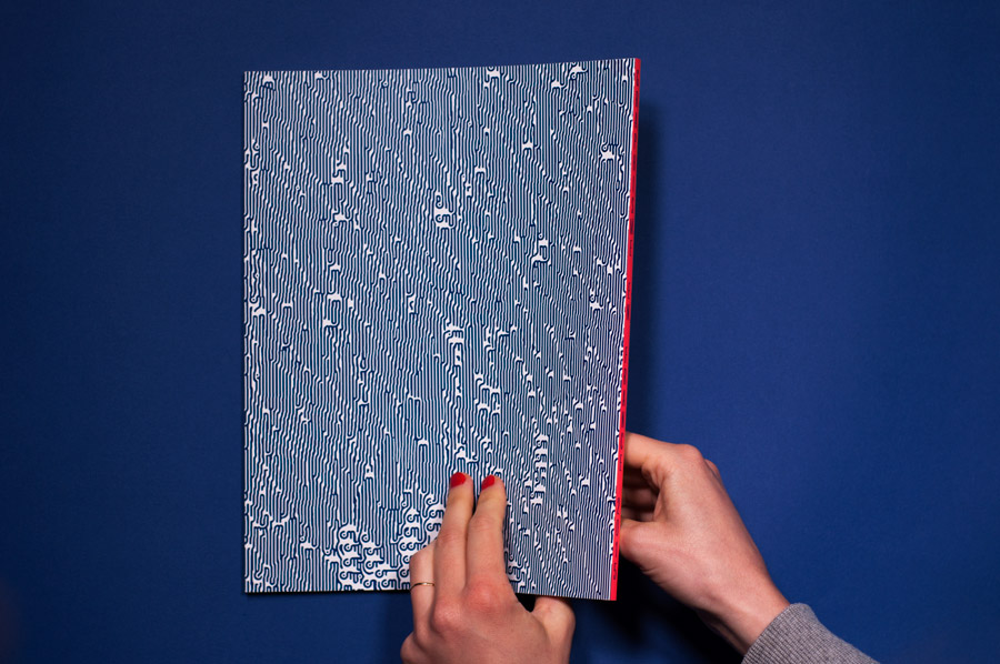
Each year, the National Centre for Visual Arts (CNAP) involves a young studio to design the publication Graphisme en France. For this edition of 2015, Ultragramme was entrusted with this mission.
Since 1994, researchers, critics and professionals have shared their viewpoints and their research on the major themes that animate the graphic design in the journal Graphisme en France, annual review for all professional graphic design and communication. The 21st issue adresses the theme of the artistic direction of press and magazines, through the contributions of Angelo Cirimele, Francesco Franchi, Pierre Ponant and Véronique Vienne.
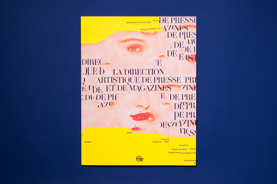
Through our choices of paper, layout, printing and typography, we have implemented a number of codes directly inspired by those of the press and magazines. Playing with these codes freely over the articles, we wanted to offer an abounding, changing and generous object.
layout
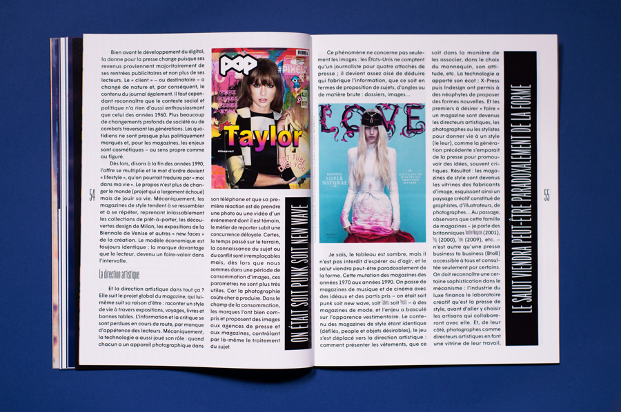
We based our design on a modular grid that allowed us to align the text alternatively on two, three and four collumns. In the same way, titles are successively centered, floated right, then left.
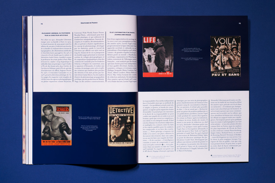
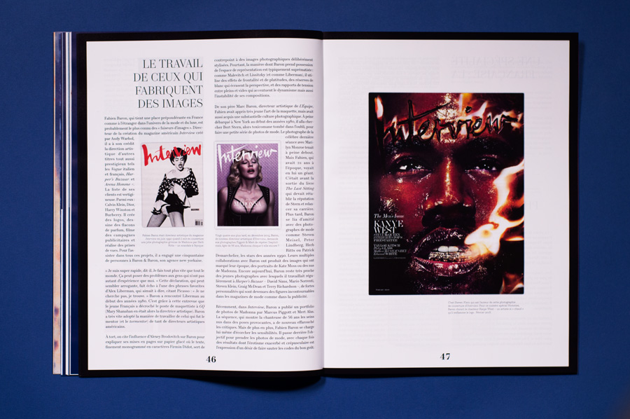
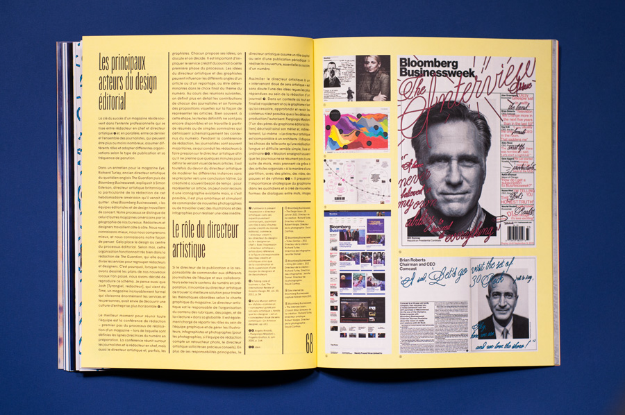
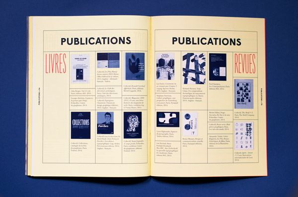
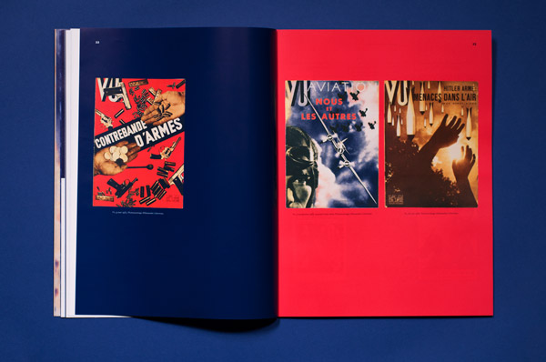
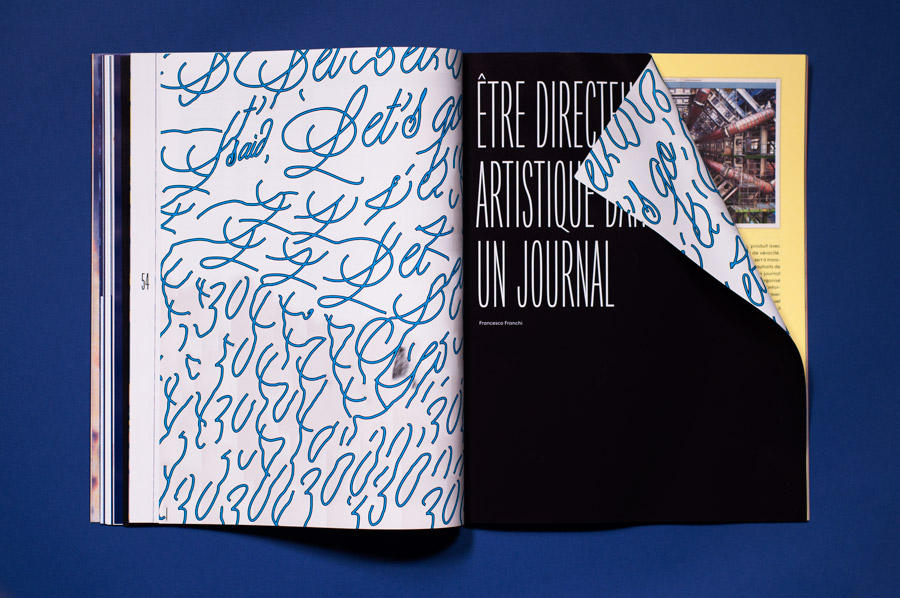
Part of the publication was printed in spot colors (dark blue, red and neon yellow), alternating pages in monochrome, two-color and three-color.
The images reproduced in three spot color tends to approach a four-color printing, but with a slight tone shift, that give them a particular sensitivity.
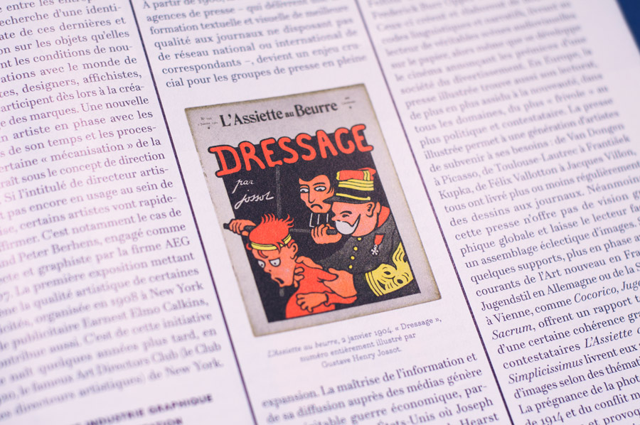
typography
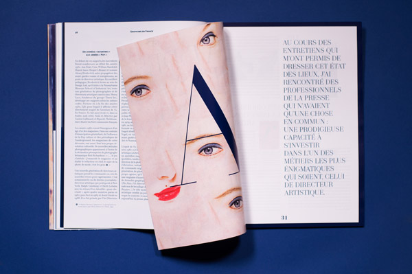
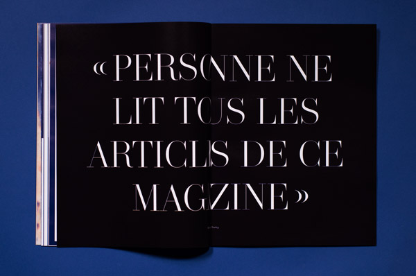
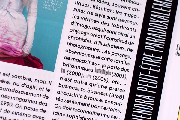
We chose three typefaces (the Trianon and the Origin Super Condensed by Production Type and the Wigrum by Bureau des Affaires Typographiques), and we switched their uses over the articles. Thus, each font is alternately used for titles, texts, as well as notes and epigraphs.
to download the PDF version of Graphisme en France, visit cnap.graphismeenfrance.fr


